# Composite Smart-Fader Design & Style Guide
## 1. Overview
The **Composite Smart-Fader** is a specialized widget that combines a traditional motorized fader workflow with a modern, touch-screen-like interface. It allows for the control of a group of parameters (channels) through a single “Master” fader, while providing a “Smart Cap” display that reveals and allows adjustment of the individual “Child” parameters.
### Key Concepts
– **Macro View (Closed):** The fader cap displays a single aggregated value (Average). Moving the fader moves all children proportionally.
– **Micro View (Open):** The fader cap “expands” (visually toggles) to reveal individual vertical strips for each child channel. Users can adjust these individual levels directly on the cap without moving the master fader position, updating their relative offsets.
– **Proportional Logic:** The system maintains offsets between the master and children. Moving the master applies the delta to all children. Moving a child updates its specific offset.
—
## 2. Configuration Parameters (JSON)
The widget is configured via a JSON object in your GUI layout file. Use the type `_CompositeFader`.
### Core Settings
| Parameter | Type | Default | Description |
| :— | :— | :— | :— |
| `type` | String | `_CompositeFader` | **Required.** Identifies the widget type. |
| `label_active` | String | “Composite” | The text label displayed above the fader. |
| `value_min` | Float | `0.0` | The minimum value for the fader and all channels. |
| `value_max` | Float | `100.0` | The maximum value for the fader and all channels. |
| `num_channels` | Integer | `4` | The number of child channels to manage. |
### Visual Layout
| Parameter | Type | Default | Description |
| :— | :— | :— | :— |
| `layout` | Object | `{}` | Container for sizing options. |
| `layout.width` | Integer | `100` | Width of the entire widget in pixels. |
| `layout.height` | Integer | `400` | Height of the entire widget in pixels. |
| `show_ticks` | Boolean | `true` | Whether to draw tick marks along the track. |
| `tick_interval` | Float | *(Auto)* | The value interval between ticks. Defaults to range / 10. |
| `tick_color` | String | `”light grey”` | Color of the tick marks. |
| `tick_thickness`| Integer | `1` | Thickness of tick lines in pixels. |
### Channel Definition
| Parameter | Type | Default | Description |
| :— | :— | :— | :— |
| `channels` | Array | `[]` | List of objects defining properties for each channel. |
| `channels[i].default` | Float | `min_val` | The initial starting value for this channel. |
| `channels[i].label` | String | “” | Label for the channel (currently unused in Micro view but good for reference). |
—
## 3. Style Guide & Visuals
### Colors
The widget automatically adapts to the global application theme (`THEMES`).
– **Background:** `theme[“bg”]` (e.g., `#2b2b2b`)
– **Track:** `theme[“secondary”]` (e.g., `#444444`)
– **Handle/Bezel:** `theme[“fg”]` (e.g., `#dcdcdc`)
### The “Smart Cap”
The fader cap is rendered as a “device” with a bezel and a screen area.
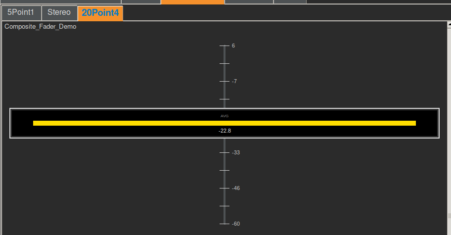
– **Macro Mode:** Displays a single bar representing the average value of all channels. Color gradients from Green (<50%) to Red (>50%).
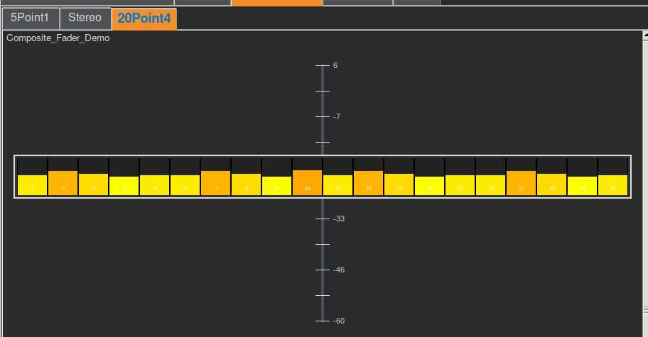
– **Micro Mode:** Displays `num_channels` vertical strips. Each strip shows its own level bar.
### Customization Tips
– **Width:** Use a wider width (e.g., `120`, `150`, or more) to allow sufficient space for the Micro view strips. A width of `40` is too narrow for 8 channels.
– **Height:** Standard fader height is `300` to `400` pixels.
—
## 4. How to Use (Interaction Guide)
### Mouse / Touch Actions
| Action | Target | Result |
| :— | :— | :— |
| **Left Drag** | Track / Bezel | **Move Master:** Moves the physical fader position. All child channels move with it, maintaining their relative offsets. |
| **Right Click** | Anywhere | **Toggle View:** Switches the Smart Cap between **Macro** (Average) and **Micro** (Individual Channels) modes. |
| **Double Click** | Anywhere | **Toggle View:** Alternative gesture to switch modes. |
| **Left Drag** | Strip (Micro Mode) | **Adjust Child:** Dragging vertically on a specific strip inside the cap adjusts ONLY that channel. The Master fader remains stationary, but the internal offset for that channel is updated. |
—
## 5. Example Configurations
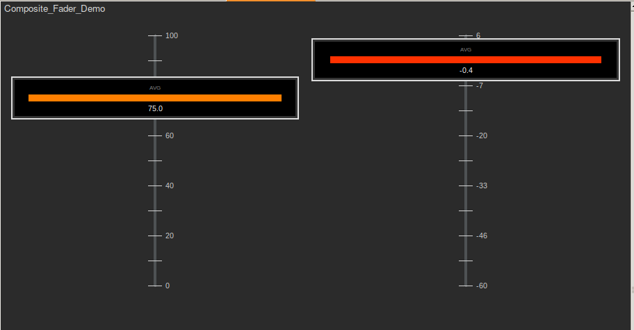
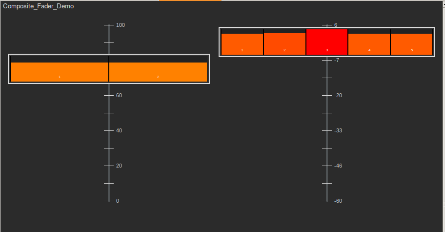
### Stereo Master (2 Channels)
“`json
“composite_stereo”: {
“type”: “_CompositeFader”,
“label_active”: “Stereo Mix”,
“value_min”: 0.0,
“value_max”: 100.0,
“num_channels”: 2,
“layout”: { “width”: 120, “height”: 400 },
“channels”: [
{ “default”: 75.0, “label”: “Left” },
{ “default”: 75.0, “label”: “Right” }
]
}
“`
### 5.1 Surround Group (6 Channels)
“`json
“composite_surround”: {
“type”: “_CompositeFader”,
“label_active”: “5.1 Group”,
“value_min”: -60.0,
“value_max”: 10.0,
“num_channels”: 6,
“layout”: { “width”: 160, “height”: 400 },
“tick_interval”: 10,
“channels”: [
{ “default”: -5.0, “label”: “L” },
{ “default”: -5.0, “label”: “R” },
{ “default”: -3.0, “label”: “C” },
{ “default”: -10.0, “label”: “LFE” },
{ “default”: -12.0, “label”: “Ls” },
{ “default”: -12.0, “label”: “Rs” }
]
}
“`
### 20.4 Immersive Bed (24 Channels)
*Note: Ensure width is sufficient for 24 strips!*
“`json
“composite_immersive”: {
“type”: “_CompositeFader”,
“label_active”: “Immersive Bed”,
“value_min”: 0.0,
“value_max”: 100.0,
“num_channels”: 24,
“layout”: { “width”: 400, “height”: 500 },
“show_ticks”: false,
“channels”: [
{ “default”: 50.0 }, { “default”: 50.0 }, { “default”: 50.0 }, { “default”: 50.0 },
{ “default”: 50.0 }, { “default”: 50.0 }, { “default”: 50.0 }, { “default”: 50.0 },
{ “default”: 50.0 }, { “default”: 50.0 }, { “default”: 50.0 }, { “default”: 50.0 },
{ “default”: 50.0 }, { “default”: 50.0 }, { “default”: 50.0 }, { “default”: 50.0 },
{ “default”: 50.0 }, { “default”: 50.0 }, { “default”: 50.0 }, { “default”: 50.0 },
{ “default”: 80.0 }, { “default”: 80.0 }, { “default”: 80.0 }, { “default”: 80.0 }
]
}
“`